

*This is a speculative project. I am not affiliated with Los Angeles Services.
Project Overview
Background
Los Angeles Animal Services is one of the largest municipal shelter systems in the U.S., with six shelters serving approximately 60,000 animals annually and responding to 20,000 emergency calls each year involving animals or people in danger. While their stat reports show an overall gradual improvement in finding homes for pets, engaging with the community and spreading awareness, redesigning their website, and refreshing their brand will increase the number of pet adoptions, fosters, volunteers and donations.
Objective
Redesign the current website to decrease cognitive load, improve navigation, and implement responsiveness to increase improve adoption metrics. To refresh the brand to communicate a more friendly and inviting story that aligns with its mission, values, and vision. In addition to a branding refresh, A responsive redesign of their current website to reduce cognitive load and create an updated and pleasant user experience.
Research Methodologies Used
Competitive Analysis
User Interviews
Secondary Research
Card Sorting
User Personas
Usability Testing
My Role
UX Researcher
UX/UI Designer
Branding Design
Design Process

Empathize
Competitive Analysis
To begin the initial research phase, I compared similar organizations and their websites to determine industry standards and what users value. Highlighting strengths and weaknesses helped me to understand what is needed to meet the needs of the organization and its users.

User Interviews
After exploring how other successful rescue organizations created their web presence as well as conducting market research, I then set out to interview users with experience in fostering, adoption, and donating to animal rescue groups.
-
User Needs
All participants need to know about the mission and goals of the organization they’re looking to adopt from, volunteer or donate to. All participants need detailed information about prospective pets as well as information about adoption fees and policies.
-
User Wants
All participants desire clear photographs and comprehensive filter categories to find a pet to adopt or foster. All participants want clear and prompt communication and transparency with donated funds.
-
Frustrations
2 out of 4 participants cited uncertain pet availability as their primary frustration with searching pets online. Other common frustrations include poor communication, lengthy adoption processes, and vague or no behavior descriptions about the animals.
-
Motivations
All participants emphasized the importance of a strong web presence and a clear mission when searching for pets to adopt/foster. All participants felt more inclined to browse if the site had comprehensive filter options on the search page. Users were stated they were more likely to donate if the organization had a strong social media presence/following and visible community involvement.
Define
Defining the Users
After gaining insights from the comparative analysis and user interviews I created two personas based on two main goals when visiting animal rescue sites.

Card Sorting
In order to understand what users might expect from a site’s information architecture and navigation, I conducted a Card Sorting exercise.
Overview
35 cards, 7 categories
6 participants
Average completion time: 6 Min 21 Sec
Completion rate: 100%
OBSERVATIONS
While analyzing the data, I noticed several patterns. Most participants agreed that locations belonged in the About Us category however, participants were unsure where to place Kennel Sponsorship and Programs and Initiatives. The most unanimous categories were locations in the About Us category, animal type in the Adopt category (which included dogs, cats, and rabbits), and adoptable pet search belonging in the adopt category. The organization of these cards tells me that each user has a different perception of where those items fit within the navigation of the site. A possible solution would be to merge some categories within the navigation menu as well as provide further detail about the specific function of the menu item to help the user differentiate between menu items and their prospective tasks.
User Flows
Using the data compiled from user interviews, card sorting, and the personas I created, user flows were created based on user needs.

Ideate
Site Map
Now that I had an idea of what users expect in terms of navigation, The next step was to determine how to improve the information architecture and decrease the overwhelming cognitive load used in the current Los Angeles Animal Services site.

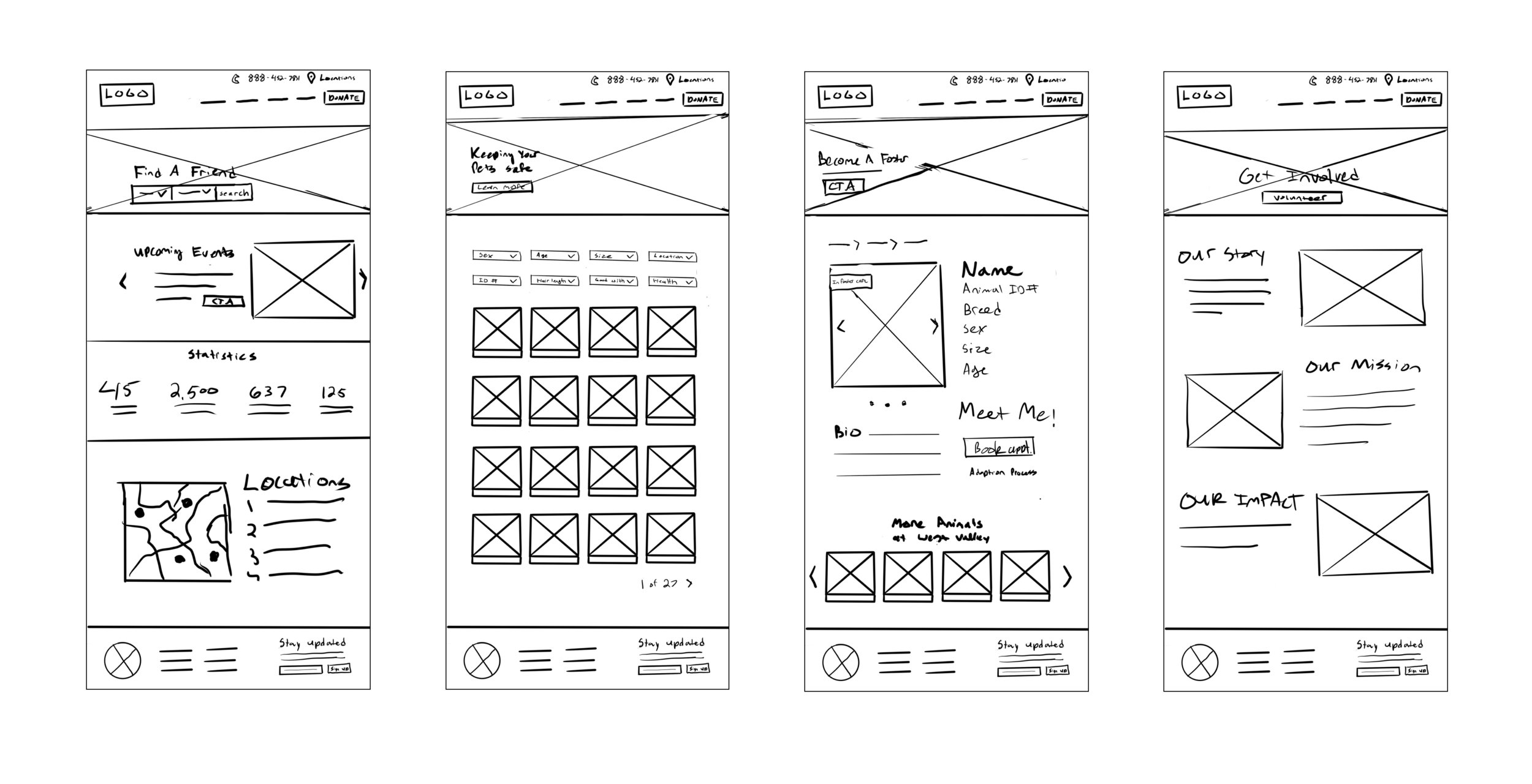
Sketching and Wireframes
After building a solid foundational structure, I started sketching possible directions. Examining other nonprofit sites, animal rescue groups, and e-commerce platforms, I explored different design possibilities.

Identity Redesign
In addition to redesigning the design and navigation of the LAAS site, I then aimed at refreshing the brand identity to communicate a friendly yet professional image.

UI Kit

Prototype
High Fidelity Screens
Applying the UI elements to the wireframes, I created key screens for the responsive site design.

Before


Hifi Prototype
To test how the site would actually function, I created a usable prototype. Users were given the task of searching for a pet and booking an appointment to adopt.

Usability Testing
Overview
Unmoderated testing
10 participants
Average completion time: 6 Min 21 Sec
Completion rate: 70%
Insights
Users were given the task of searching for and booking an appointment to adopt a pet.
2 participants gave up citing confusion about location filter
5 users felt that the hero banners on each page were distracting
8 participants agreed that the UI design was clean and the navigation menu was clear
Next Steps
Some further testing would reveal more insights into user frustrations and how the experience can be improved. In retrospect, conducting a usability test with the current website could have potentially revealed more detailed data about user frustrations.